

Brand Identity Launch — Apparel Naming, Logo & Garment Branding
Mark Zürich
Building an International-Standard Clothing Brand from Madurai
Gallery
Mark Zürich was conceived as a clothing brand from Madurai with an ambition that went beyond being perceived as just another regional apparel label.
The challenge was to create a brand identity that could stand confidently alongside established national and international fashion brands—from its name and visual identity to its colours, typography, logo and overall brand expression.
At the early stage, Mark Zürich was not an international brand. But the ambition was international.
Leverage Advertising took up the challenge of transforming that ambition into a distinctive brand identity. The objective was simple: create a brand from Madurai that looked like it belonged anywhere in the world.
The Leverage Approach
Leverage did not begin with a logo.
The branding exercise started by looking at the brand as a complete experience.
1. Naming the Brand
The name MARK ZÜRICH was developed to create a strong, sophisticated and contemporary perception.
The combination of the two words was intended to give the brand a cosmopolitan character while remaining distinctive and memorable in the Indian apparel market.
The name itself became an important part of the brand's positioning.
2. Creating the Brand Personality
The brand needed to communicate:
- International quality
- Contemporary fashion
- Confidence
- Sophistication
- Youthfulness
- Premium appeal
- Strong visual individuality
Every design decision was therefore evaluated against one question: Does this look like a local clothing label—or a brand with international aspirations?
3. Logo Conceptualisation
The logo became the visual signature of Mark Zürich.
Rather than using a conventional fashion symbol, Leverage developed a distinctive geometric symbol that could work independently from the brand name.
The symbol was designed to be:
- Simple enough to be recognised
- Distinctive enough to own
- Strong enough for garment applications
- Flexible enough for different sizes
- Suitable for embroidery, printing and labels
- Memorable even without the wordmark
This was particularly important because a clothing brand needs an identity that can live comfortably on garments, tags, buttons, packaging, signage and communication material.
Logo Rationale
The Mark Zürich symbol is built around a geometric, rhythmic structure.
The repeated angular forms create a sense of movement, energy and contemporary fashion, while the symmetrical construction gives the mark stability and balance.
The lower geometric element provides a distinctive finishing point, helping the symbol become more than a decorative pattern.
The overall construction deliberately avoids being overly illustrative. It is a symbol designed to become a brand signature.
This gives Mark Zürich the flexibility to use the symbol independently—for example, on a garment—while retaining a strong connection with the complete Mark Zürich identity.
Typography
The typography was selected to create a strong fashion-oriented presence.
The bold, condensed character of the wordmark gives the brand presence, confidence and modernity.
The distinctive treatment of ZÜRICH, including the umlaut, further contributes to the brand's visual personality and helps differentiate the name from conventional Indian apparel-brand naming.
The relationship between the symbol and typography was carefully explored through multiple configurations before arriving at a system that could work across different applications.
Colour Strategy
Colour was treated as an important part of the brand personality rather than simply a decorative choice.
The identity was explored in neutral, monochromatic and metallic-inspired treatments to ensure that the logo could adapt to different fabrics, garment colours and production methods.
A particularly important consideration was reproduction on clothing. A logo that looks good on a screen may not necessarily work well when:
- Embroidered
- Screen printed
- Woven into labels
- Foil stamped
- Printed on packaging
- Applied at very small sizes
The Mark Zürich identity was therefore developed with real-world apparel applications in mind.
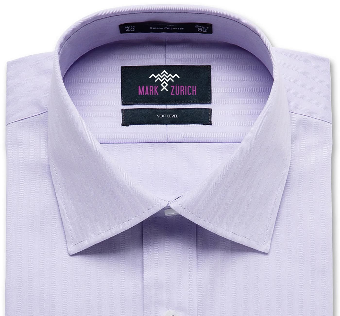
From Logo to Garment
The true test of an apparel identity is not a presentation board. It is the garment.
The Mark Zürich symbol was designed to become part of the product itself.
The example shown on the garment demonstrates how the identity can function as a small, premium brand signature, rather than overpowering the clothing.
This creates an important distinction: the brand does not have to shout to be noticed.
Creating Retail Confidence
For a new apparel brand, retailers need to believe that the brand has a future.
Packaging, garment branding, labels, visual consistency and professional presentation all contribute to that confidence.
Leverage therefore approached Mark Zürich not simply as a logo-design assignment, but as a brand-building exercise.
The intention was to create an identity that could help the brand enter the market with the confidence of a much more established label.
The Outcome
The branding exercise gave Mark Zürich a distinctive identity and a clear visual personality.
The brand was able to present itself to Indian retailers with a look and feel that communicated quality, sophistication and international aspirations.
The identity received a strong and encouraging response from Indian retailers, helping establish the brand with a level of visual credibility beyond its relatively young market presence.
More importantly, Mark Zürich demonstrated an important branding principle: a brand does not have to come from an international market to look international. It needs international thinking.
What Leverage Built
The Mark Zürich project involved much more than creating a logo. Leverage worked on:
- Brand Naming
- Brand Positioning
- Brand Personality
- Logo Conceptualisation
- Symbol Development
- Typography Selection
- Colour Direction
- Logo Variations
- Garment Branding
- Brand Application Thinking
- Retail Presentation
- Overall Visual Identity
The result was a brand identity created to give a Madurai-born clothing brand a national and international visual ambition.
The Leverage Difference
Many branding projects begin with: "What should the logo look like?"
Leverage began with: "What should the brand become?"
That difference shaped the entire Mark Zürich exercise. From naming to typography, from symbol to garment application, every element was considered as part of one larger brand story.
The goal was never merely to make Mark Zürich look good. The goal was to make Mark Zürich look like a brand that could grow.
Born in Madurai. Designed with a global ambition. Built to look beyond its geography.
We don't just create identities. We create brands with the ambition to go further.
FAQ
FAQs — Mark Zürich
No. Mark Zürich was an emerging clothing brand from Madurai. The branding objective was to create an identity with an international-standard look and feel and the potential to support future growth.
Want Something Like This for Your Brand?
Book a consultation and we'll talk through what's possible for you.